Back
BackMonthCalendar Control
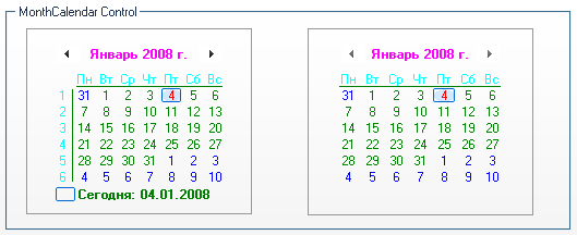
The MonthCalendar control allows the user to select a date using a visual display.
You should start Month Calendar skin building by checking the appropriate checkbox in "Default Controls" that is located in front of "Month Calendar" item. Then you should note that SkinBuilder supports Normal, Pressed and Disabled states for Month Calendar control which should be customized in Properties pane. Properties pane seems to be very complicated due to the great number of fields contained. After examination you'll see it is not the case.
 |
 |
Normal |
Pressed and Disabled |
The skinning process consists only of two steps:
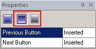
 Insert your pre-created images in assigned fields by clicking "Browse" button (
 ) and selecting images in "Select file" window. Image handling implies Margins values setting and Drawing mode (Stretch/Tile) assignment.
 Note:
Note:
We've changed the colors in Properties pane to show the result of Month Calendar skinning. Compare what color field refers to each control item and the explanation of these fields will be unnecessary.