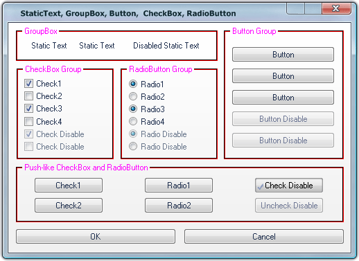
Group box
This article explains how to skin Group box component. Generally Group box is a grouping control drawn with defined colors that are used for frame and for title text.
Changing Color parameters for Text, Light and Dark Lines via "Properties pane" will effect immediate changes in Preview area allowing you to see what Group box will look like at run-time.
"Normal" and "Disabled" states are available for skinning.
Customizing process of Group box's appearance according to your own designs consists of the following steps:
 Click on "Text Color" field which is filled with RGB (0, 0, 0) by default. Palette will appear.
  Select a preferable Color for Text, Light Line and Dark Line.
  Choose "Custom color" if items listed in palette doesn't suit you. The standard "Color" window will appear.
When all fields are filled you can see the result shown in Preview area.


 Back
Back