
 Back
BackProperties pane
"Properties pane" contains attributes which you can modify due to chosen control type. "Properties pane" can be
viewed after clicking at the control name in the "Default Controls" window. Settings displayed in "Properties pane" depend on a
control type selected. This pane is the one you will have to work with most of the time when handling skin images, regions, colors
and other settings.
Make sure that each control type has a specific set of attributes. You can compare Frame Window and Button settings shown on the picture.
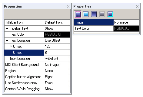
Settings refer to the extrinsic qualities of objects—where an "object" may be of any control type. So we can adjust the
most common attributes Image, Regions, Text Color, Borders values and others which influence on a control visualization.
Settings configuration for Button control is usually started with picking an image.
To pick an image:
 Press "Browse" button
  in a field where "No image" presents (if you create a new skin). A standard "Select file" dialog will appear.
Go to the directory where your picture is located, select it then click OK button.
When the procedures are finished image will be applied to the target control displaying in Preview area and "Image" field will have "Inserted" value.
For managing your work more efficiently take advantage of Clipboard fingertip access.
Follow instructions to dynamically modify the Text Color property, choose a proper color in Color Palette as desired:
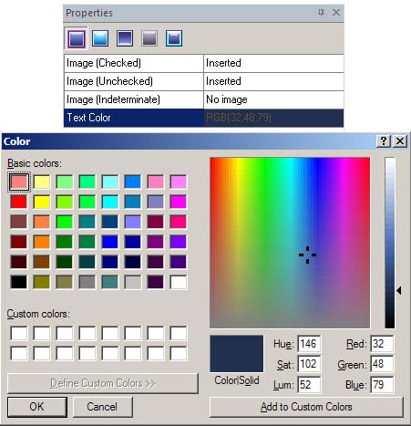 Click at the "Text Color" field which is filled with RGB (0, 0, 0) by default. Color palette will appear. If the color you want to apply is not presented in the palette click at "Custom color",
a standard "Color" window will appear. The selected color will be displayed in "Custom color" item of "Text Color" property.
Click at the "Text Color" field which is filled with RGB (0, 0, 0) by default. Color palette will appear. If the color you want to apply is not presented in the palette click at "Custom color",
a standard "Color" window will appear. The selected color will be displayed in "Custom color" item of "Text Color" property.