
 Back
BackPush-like Radio and Check Box
Suggested topics:
Drawing modeControl states
Margins
Check box and radio button
Button
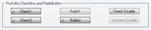
Push-like Radio and Check Box are similar controls with slight differences in functionality and one "Properties pane" for both though these controls have a distinguishing characteristic. Push-like Check Box is a combination of Check Box and Button; Push-like Radio Button is a combination of Radio Button and Button.
Taking advantage of SkinBuider functionality provided by the following settings in "Properties pane"assigned for each button state you can change Push-like Check Box and Radio Button appearance:
1. Image (Checked)
2. Image (Unchecked)
3. Text Color (Checked)
4. Text Color (Unchecked)
Highlighted and Pressed states contain the additional Text Offset field:

"Text Offset" (X Offset/Y Offset) is a position of Push-like Check Box and Radio Button text in layout relative to the default position of text where X offset determines distance from the left and Y offset determines distance from the top (for Highlighted state); X being distance from the right and Y being distance from the bottom (for Pressed state).
Let's accomplish skinning of Push-like Check Box and Radio Button controls using images prepared earlier:
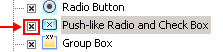
 Tick off the check box in front of "Push-like Radio and Check Box" control type in "Default Controls" pane.
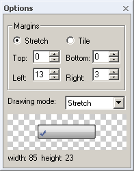
 Choose the "Normal" state in "Properties pane" and insert images for "Image (Checked)" and "Image (Unchecked)" Set Margins values and Drawing mode in "Options pane". The standard control images are 85x23 pixels. The preferable drawing mode should be "Stretch" as the size depends on system settings.
 Select a text color in "Text Color" palette. Assign "Text Offset" for Highlighted and Pressed states.
 Repeat the described process for the rest of Push-like Radio and Check Box states ("Highlighted", "Pressed", "Disabled" and "Focused").