
 Back
BackCheck box and radio button
Suggested topics:
Drawing modeControl states
Margins
Check box and Radio button are similar controls with marginal differences in functionality that's why we unite these two topics in one.
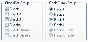
Two appropriate images for each state skinning should be inserted in "Properties pane". That means there are two variations of Radio buttons and Check boxes you can use easily when you create the control look you want using SkinBuilder - one with labels, one without it.
 |
 |
a) For Check Box Control |
b) For Radio Button Control |
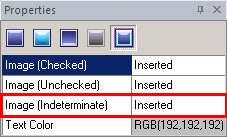
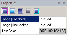
"Properties panes" for both controls have the same functionality but it should be mentioned that there is the additional Image (Indeterminate) field in Check Box "Properties pane".
 Note:
Note:
You can insert the proper images in Image (Indeterminate) field. In case there is no image for this field, SkinBuider automatically inserts the image from Image (Checked) field of Disabled State into all empty Image (Indeterminate) fields for all states.
Usually the standard control images are 13x13 pixels, but the size depends on system settings, so the preferable drawing method should be "Stretch".
Note:
Before skinning don't forget to check the appropriate check box in "Default Controls" pane that allows you to watch all visible changes displayed in Preview area.
The following example can illustrate the Radio button skinning process:
 Choose the "Normal" state in "Properties pane" and select images for "Image (Checked)" and "Image (Unchecked)" variations clicking "Browse" button (
 ).
).
Set margins values and drawing mode in "Options pane".
Select a text color in "Text Color" palette.
Repeat described procedures for the rest of Radio button states ("Highlighted", "Pressed", "Disabled" and "Focused") and for all Check Box states.
Image (Checked)

Image (Unchecked)

Image (Indeterminate)

Image (Checked)

Image (Unchecked)
