
 Back
BackControl states
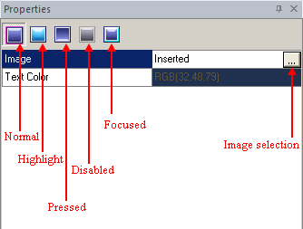
Handling control state images in "Properties pane" allows you to specify images to be used for accomplishment an application-specific state of a control.
Before you start planning a skin, it is important to know what states of a control are supported by SkinBuilder. You will need to prepare different images beforehand for each control state. Usually, in standard Windows application images look very similar in each state, with only changes in brightness or a reversal of a bevel according to state.
You should remember:
 Not all of the controls support every state, e.g.: listview cannot be pressed and etc.
Images used for different states do NOT have to be of the same size. There is no limitation or constraint for image size,
each image can be as small as one pixel or as large as wallpaper, however, this would take more system resources and enlarge your .skf file.
Any image in SkinCrafter has such attributes as Drawing mode and Margins (Left/Right/Top/Bottom). The "Tile" drawing mode is noticeably faster then "Stretch" when drawing on large areas (E.g.: dialog form), but pretty much the same on small ones.
Every control supports a certain amount of states but the states described below are applicable to buttons.
In SkinBuilder there are currently five button states:
State |
Image |
Explanation |
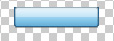
Normal |
 |
If the button is not being used, but could be clicked on, and the mouse cursor is not over it, the button will be displayed as follows. |
Highlighted |
 |
The way a button will look like if the mouse cursor is over it without clicking on the control. |
Focused |
 |
Selecting the button you receive the focus. You can lose the focus when select another control. Only one control can have the focus at a time. |
Pressed |
 |
This state in a classic Windows application can be presented either pushed or not (a button can be drawn as a sunken button otherwise as a raised). In our case the button has the prominent effect. |
Disabled |
 |
This state in a classic when the button is not available or doesn’t interact with you (as would be the case for 'stop' when nothing is running). |
Each state can be presented as by a different .BMP or .PNG image (Semi-transparency). These images are switched when the control switches states. In general, a newly created image can be given a name you prefer. But the images delivered with SkinCrafter Demo Tour are named by the base name of the control followed by an underscore, indicated the state letter (the first letter of the state name) and finished by file extension. So, the button state set (button set for each state) consists of five files:
For the Normal state - button_n.png
For the Highlighted state - button_h.png
For the Pressed state – button_p.png
For the Disabled stae – button_d.png
For the Focused state – button_f.png