
 Back
BackTree control
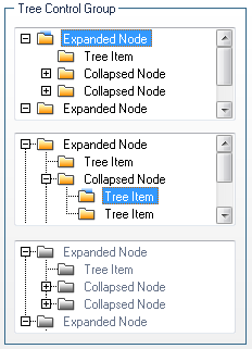
Tree Control is usually accompanied with Scrollbar control in case the content isn't fit to the assigned area but also Tree Control can be a separate component.
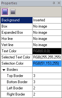
"Properties pane" where you actually change the attributes for each Control state contains Background, Box, Expanded Box, Horizontal and Vertical lines, Text Color, Selected Text Color, Selection Color and Borders settings.
All these settings are available for both Normal and Disabled states except the Borders property for the last state.
 Note:
Note:
If you don't insert images into the fields as shown in our skinning example SkinBuider makes these elements standardized as in the Windows applications.
We start Tree control skin building by checking the appropriate checkbox in "Default Controls" that is located in front of "Tree Control" item. And then follow these steps:
 Import images in Background, Box, Expanded Box, Horizontal line and Vertical line fields of "Properties pane" by clicking "Browse" button (
 ).
).
Select a preferable Color for Text, Selection and Selected Text.
Define (Top/ Bottom/ Left/ Right) Borders values.
Note:
To make sure the latest changes in your skin are shown in Preview area you should regularly hit the "Refresh" button  on the toolbar.