Back
BackList control
If you want to create skin for List Control you have to understand the basics of SkinBuilder functionalities. Prior knowledge of "Properties pane" and "Options pane" articles is required and comes in quite handy in troubleshooting when you import images and adjust borders settings. You will also need to define what pre-created image and borders values you wish to customize for List control.
Actually for List control skinning you should change attributes in ""Properties pane".
Only Normal and Disabled states are available for List control skinning. Image, Grid Color, and Text Color settings can be adjusted in "Properties pane" for both Control state plus Selection Color, Selected Text Color, Hot Item Color, and Borders settings for Normal state.

We will start List control skinning by checking the appropriate checkbox in "Default Controls" that is located in front of "List Control" item. And then follow these steps:
 Import an image in Image field of "Properties pane" by clicking "Browse" button (
 ).
).
Select a preferable Color for Grid, Text, Selection, Selected Text and Hot Item.
Define (Top/ Bottom/ Left/ Right) Borders values.
 Notes:
1. The inserted image identifies background that is the one needed to fill the whole client area of the list control.
2. Make sure that you are always looking at the latest version of your skin. Actually all changes are applied automatically but for your assurance you should hit the "Refresh" button  on the toolbar.
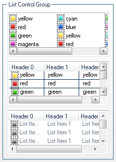
And that's it! Our template of List Control skin is finished: