
 Back
BackToolStrip
ToolStrip is a horizontal row that has no limits on quantity. ToolStrip can have custom appearance and behavior, all with or without themes.
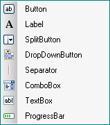
ToolStrip control is a combined control which consists of:
-Button |
 |
 Note: This control is new in the .NET Framework version 2.0.
The Toolstrip component skin consists of images which make your application more attractive. You need to import appropriate graphics corresponding to the different Control states (Normal/Highlighted/Pressed/Disabled) of the Toolstrip buttons.
 |
 |
 |
Normal State |
Pressed and Highlighted |
Disabled |
Skin creation process
Note: ToolStrip preview in SkinBuilder isn't a ToolStrip control. Here ToolStrip is a model giving a general idea of the skinned control appearance.
Before skinning don't forget to check the appropriate check box in "Default Controls" pane that allows you to watch all visible changes displayed in Preview area.
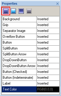
When you switched to "Properties pane" the following attributes for "Normal" state should be customized to change the visual appearance of toolbar as you desire.
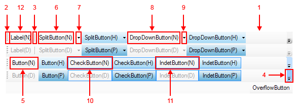
To insert your pre-created images in Background(1), Grip(2), Separator image(3), Overflow button(4), Button(5), SplitButton(6), SplitButton Arrow(7), DropDownButton(8), DropDownButton Arrow(9), Button (Checked)(10), Button (Indeterminate)(11) or Label(12) click "Browse" button (
 ) and select images in "Select file" window. Image handling implies Margins values setting and Drawing mode (Stretch/Tile) assignment.

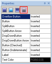
In case you use the image with text for skinning your ToolStrip component you can adjust "Text Color" option in Properties pane by means of built-in palette "Color" or choosing a "Custom Color".
Note:
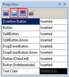
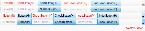
Be careful to customize all supported control states. At this ToolStrip model properties are shown by N, H, P, D letters:
(N) - Normal
(H) - Highlighted
(P) - Pressed
(D) - Disabled.