
 Back
BackCaption Buttons
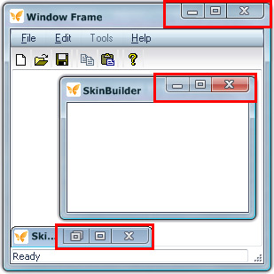
Whenever you take your mouse cursor to the top-right corner of a skinned window frame and hover over the buttons (close/minimize/maximize/restore/help) SkinBuilder changes the visual aspect of the buttons in order to indicated Control states. Changing this effect becomes possible via adding various images which represent each state button.

1. First off all, the following four control states provided in "Properties pane"
- Normal
- Highlight
- Pressed
- Disabled
Each state requires an image to be inserted in "Properties pane" for caption buttons.
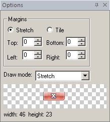
2. Secondly, you need to specify the size (Width and Height) of each button ("restore" button sizes are equal to "maximize" button ones). These values must be proportionally adjusted to "Side width" size. If one state image button is bigger than the frame side, it will look very strange even when the button changes its state. If one image design is bigger than the other, it can be acceptable in any state, but in case when Semy-transparency is properly used you can reach the result of shape and form changing.
3. Thirdly, offsets from upper-right window corner set the appropriate button location. As pertaining to layout code, position of element in layout measured in pixels, X being distance from the right edge and Y being distance from the top border.
Let's add a "Close" button in our skinning example being guided by the following steps (make sure the appropriate Window Frame checkbox is marked and "Close Button" element is selected in "Default Controls" pane):
 Choose the "Normal" state in "Properties pane".
Insert an image in "Image" field by clicking "Browse" button ( ). In appeared "Select file" window select the file you need to insert.
Set up the button size based on image size which is shown in "Options pane" bottom part.
Assign X and Y offsets to arrange button allocation.
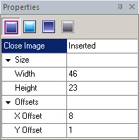
Concerning our skin adjustment all buttons have the same height (23 px) but the different width:
"Close button" - 46 px
"Maximize button" - 25 px
"Minimize button" - 29 px
Y Offsets is the same (1px) for all buttons but X Offsets vary:
"Close button" - 8 px
"Maximize button" - 54 px
"Minimize button" - 79 px
Now look at the following pictures to see how the caption buttons change in four control states taking the close image as an example:
 |
 |
a) Normal State |
b) Highlight State |
 |
 |
c) Pressed State |
d) Disabled State |