Back
BackMenubar
Suggested topics:
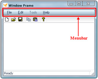
Menubar is a horizontal bar in upper part of the parent window under the title bar containing options (menu items) available in active application.

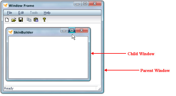
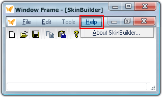
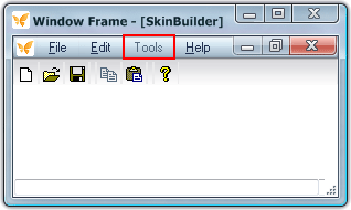
When you expand a child window with the help of the maximize button caption buttons of the child window transform to menubar buttons as you can see at the following pictures:
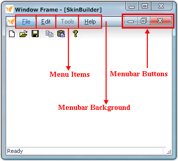
Thus menubar contains menu items or pull-down menus (File/Edit/Tools/Help), menubar background and menubar buttons (close/restore/minimize) that will be considered below in detail.
Menu bar assembling
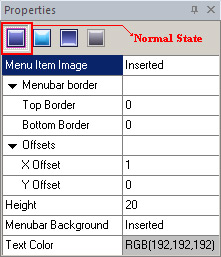
Choosing "Menubar" item in "Default Controls" will make "Properties pane" available to control settings. Fields provided below in "Properties pane" are quite clear from the titles but we are going to clarify some of the obscure points.
If you hover your mouse cursor over the menu items (File/Edit/Help) or click on one of them SkinBuilder changes the visual aspect of the items according to four Control states (Normal/Highlight/Pressed/Disabled).
Now be guided by the following example of Menu bar assembling. The steps to take are as follows:
1. Choose the "Normal" state in "Properties pane".
2. Insert an image in "Menu Item Image" field by clicking "Browse" button ( ) and choose the file you need to insert.
3. Define (Top/ Bottom) borders values to show visual boundaries that separate the menubar as a single unit.
4. Specify "Offsets" (X Offset/Y Offset) i.e. position of menu items in layout where X offset determines distance from the left and Y offset determines distance from the top.
5. Specify the "Height" of the menu item images.
6. Insert an image in "Menubar Background" field by clicking "Browse" button () and choose the file you need to insert.
7. Specify "Text Color" properties taking advantage of built-in color palette or choose "Custom Color" as alternative for color selection.
Don't forget to assign the Drawing mode in "Options pane" after images are inserted.
Remark:
The other "Properties pane" states (Highlighted/Pressed/Disabled) contain only two fields: "Menu Item Image" and "Text Color".
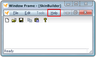
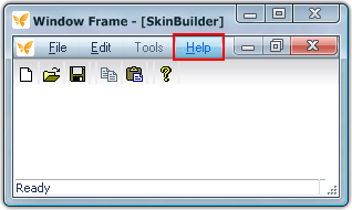
Look at the following pictures to view how menu items change in four control states:
 |
 |
a) Normal State |
b) Highlight State |
|
|
c) Pressed State |
d) Disabled State |
Menu bar buttons
Three control states (Normal/Highlighted/Pressed) provided in "Properties pane" require the proper images to be inserted for menubar buttons.
Mark the appropriate Window Frame checkbox and select "Restore Button" element in Default Controls pane to add a "Restore" button as an example. Be guided by the following steps:
1. Choose the "Normal" state in "Properties pane".
2. Insert an image in "Image" field by clicking "Browse" button () and select the file you need to insert in "Select file" window.
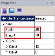
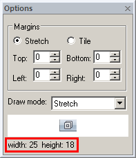
3. Set up the button size based on image size which is shown in "Options pane" bottom part.
4. Assign X and Y offsets to arrange button allocation.