
 Back
BackCombo box
At this chapter we'll embark on SkinBuilder to quickly create the Combo box skin. We'll insert pre-built images, modify properties, and skin the Combo box component that will be displayed in your end-user application. But first of all you should look at the following prerequisites:
Control statesDrawing mode
Margins
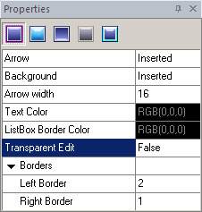
Checking the appropriate checkbox in front of "Combo Box" in "Default Controls" pane you allow the changes to be viewed in Preview area. And now let's customize Combo box by modifying attributes in "Properties pane". The following items are presented for "Normal" state:
• Arrow
• Background
• Arrow width
• Text Color
• ListBox Border Color
• Transparent Edit
• Borders
 Note:
Note:
Transparent Edit (False/True) makes Edit background transparent in the DropDown ComboBox (see Notes in the end of this chapter).
The basic procedures for creating skin are as follows:
 Click on the "Arrow" field making the "Browse" button (
 ) appear. Choose a pre-built image in "Select file" window and insert it.
Repeat the same for "Background" image handling.
Adjust "Arrow width" property. Be guided by image size that was assigned in "Arrow" field. It makes no matter, if image and arrow sizes are disagreed. You can Stretch or Tile arrow image to bring sizes in compliance.
Define "Text Color" property taking advantage of built-in palette or choose "Custom Color" as alternative.
Repeat the previous procedure for "ListBox Border Color" customization. If assigned settings are not visible check the availability of "Borders" property in "List Box" that can be equal 0.
Choose the appropriate Transparent Edit values (True or False).
Define (Left/ Right) Borders values.
After accomplishment of the predefined procedures the result according to our example can be the following.
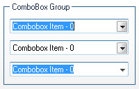
It should be mentioned that there are two combo box types: drop down combo box and drop down list combo box. At first sight, they seem to be identical but if you compare them you'll see they differ.
Notes:
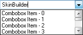
- In DropDown ComboBox list box is not displayed unless the user selects an icon next to the edit control. The current selection in the list box is displayed in the edit control.
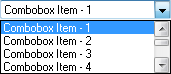
- DropDownList ComboBox is similar to DropDown, except that the edit control is replaced by a static-text item that displays the current selection in the list box.
Remarks:
"Arrow" property can also be changed in "Highlighted", "Pressed" and "Disabled" control states.
"Background" and "Text Color" properties are also available for changing in "Disabled" and "Focused" states.