
 Back
BackSuggested topics:
Properties paneDrawing mode
Margins
Check Box and Radio Button
Edit Box
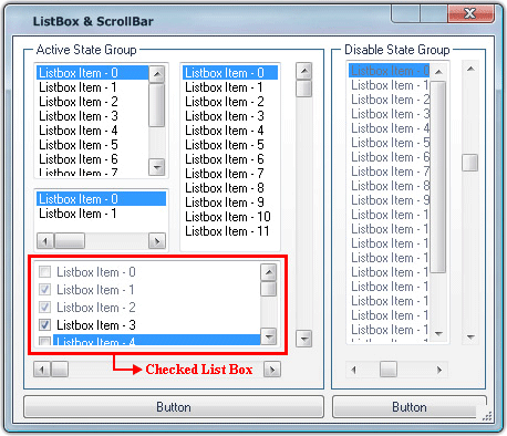
You can easily create your own skin for List Box with SkinBuilder tools. Similarly to Edit Box skinning List Box skinning is a matter of working on the graphic and text colors. To start List box skinning you should check the appropriate checkbox in "Default Controls"pane.
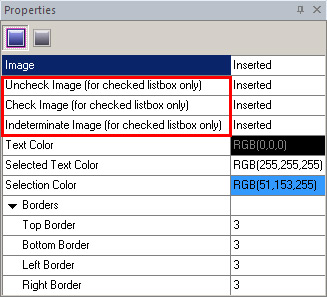
There are only two states available for List Box control skinning: Normal and Disabled. To skin List box control you should adjust the following items in "Properties pane":
• Image
• Uncheck, Check, Indeterminate Images
• Text Color
• Selected Text Color
• Selection Color
• Borders
Despite of a seeming complication "Properties pane" items are quite clear from the fields' titles. Two "Properties panes" (for Edit box and List box) are similar but the last contains three additional items for checked list box.
For List box skinning we recommend to be guided by the following steps:
 Import images in Image field for typical List Box and insert images in Uncheck Image, Check Image, Indeterminate Image fields for checked list box by clicking "Browse" button (
 ). Adjust Text Color, Selection color and Selected Text Color to achieve the desired effect. Define (Top/ Bottom/ Left/ Right) Borders values. Adjust the necessary items for Disabled State.
 When the steps described above are fulfilled, the skinned List box should be updated automatically otherwise press "Refresh" button.
 Notes:
1. Drawing mode and Margins settings are available only for the inserted images.
2. Image, Uncheck Image, Check Image, Indeterminate Image and Text Color properties can be acceptable for modification in "Disabled" state.